Hack The System Slogan Posters: Interview with Ferdinando Verderi
Could you tell me a little about the initial conversations you had with Jefferson about the book – what he wanted to create and what he wanted it to look like?
Jefferson and I started talking about this book more than 2 years ago, in late 2013.
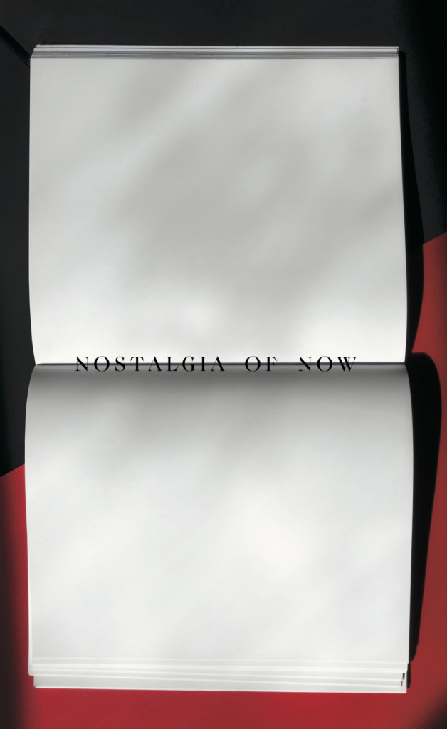
One particular challenge instantly became interesting to us both: Jefferson is an extremely forward thinking creator, a pioneer always projected into the future, while any retrospective project is by definition focused on the past.
This was the paradox we needed to solve, reason why we envisioned a project that would subvert the main dynamics of a typical monographic retrospective: we started by thinking of a book that, unlike other retrospective projects, would not feel like the end of long process, but like the beginning of a new one; instead of focusing on providing answers to never before answered questions, we focused on raising question that don’t yet have an answer; instead of thinking about a book that celebrates the past of on person, we though of one that envisions the future of a community yet to be formed.
The book started as an exploration of these dichotomies. Every aspect of it, including the title, the design, the posters slogans, the way the book is organized and edited, are all expressions of this very single minded search. Finally, the 5000 different covers, featuring the spreads from the book un-carefully merged onto each-other, challenge the very content of the book itself, as well as the notion of visual control, by letting a machine irreverently clash all the content onto itself.
And how is this reflected in your design?
This book does not want to hero the past, but wants to use the past as a canvas on which to envision a future. There is no reverence towards the archive. There is a sense of future re-organizing the past as he wishes it to be: this idea has informed my design.
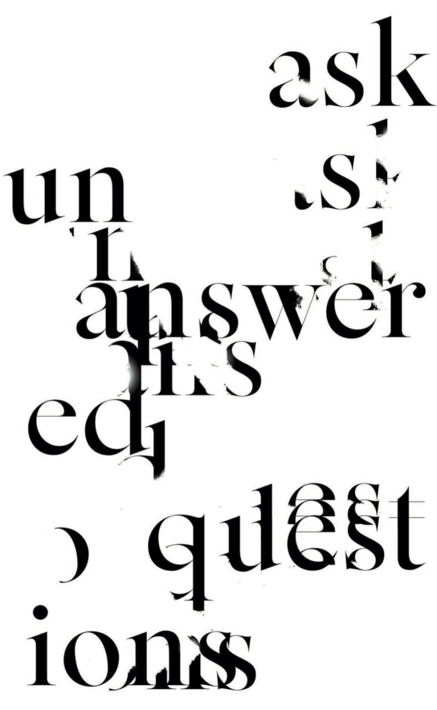
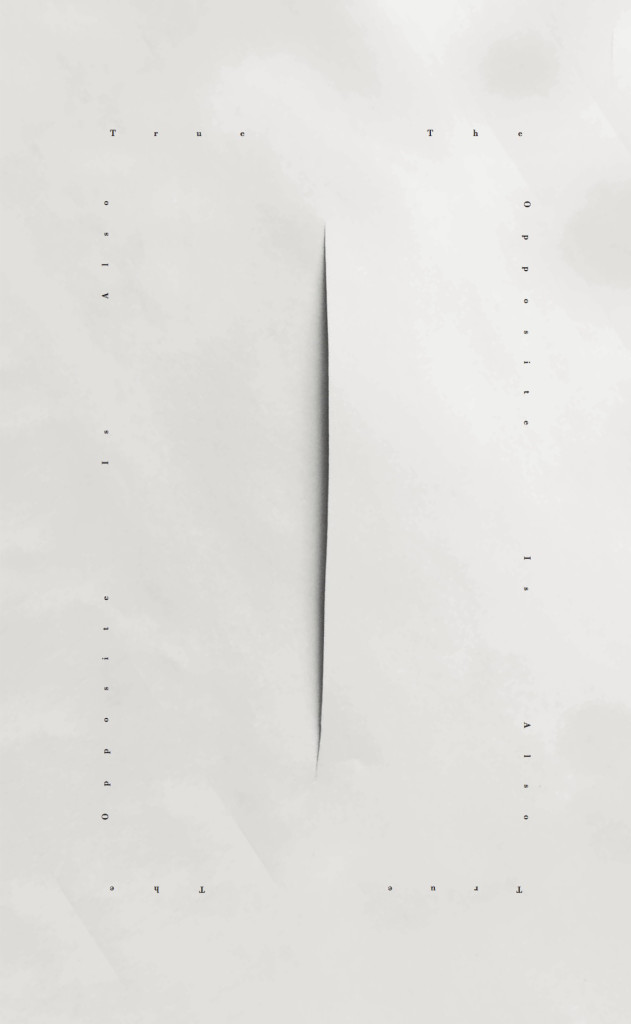
The book main design feature is its rhythm, the flow of which is intentionally interrupted by dissonant sections and elements. The book is built in a perfectly symmetric way from front to end, with the original content at its extremes and the archival content at its centre, providing a sense of circularity. The archival content is broken up into chapters by series of uncomfortably challenging bold and sharp questions which introduce each of them.
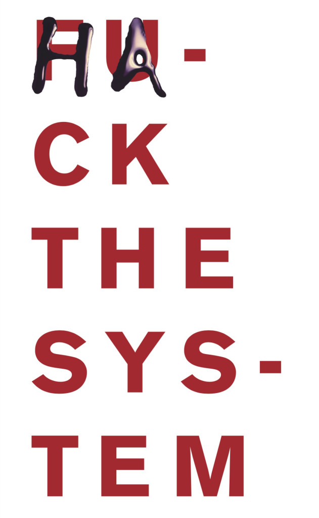
Jefferson is a very sophisticated thinker, yet always radical. His creativity is very non linear yet very organized. I was drawn to ideas that would visualize this sense of elegant disruption. I wanted the archival context to feel extremely rigorous, scientifically organized, impersonal and precise, and the new content, as the posters, the outro manifesto and the covers to feel unruled, hand crafted and raw, incoherent.
The constant is that every part of the book is subjected to a vertical flow: two side bars and one wide break in the gutter impose themselves onto every spread, constraining all the content under the rigid rules of this deliberate structure. The side notes become an important informative archive element, while the gutter irreverently breaks every archival opener forcing us to see it as new. This tries to communicate that the book in itself, not the content, is the work: it’s not about the archive, but about its message.
How did the idea for the original artworks using quotes from Jefferson come about? And what was the inspiration for these, beyond the quotes themselves?
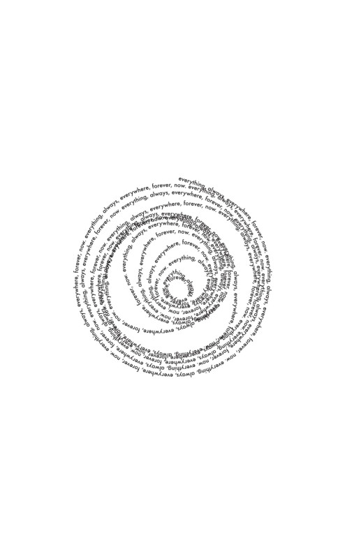
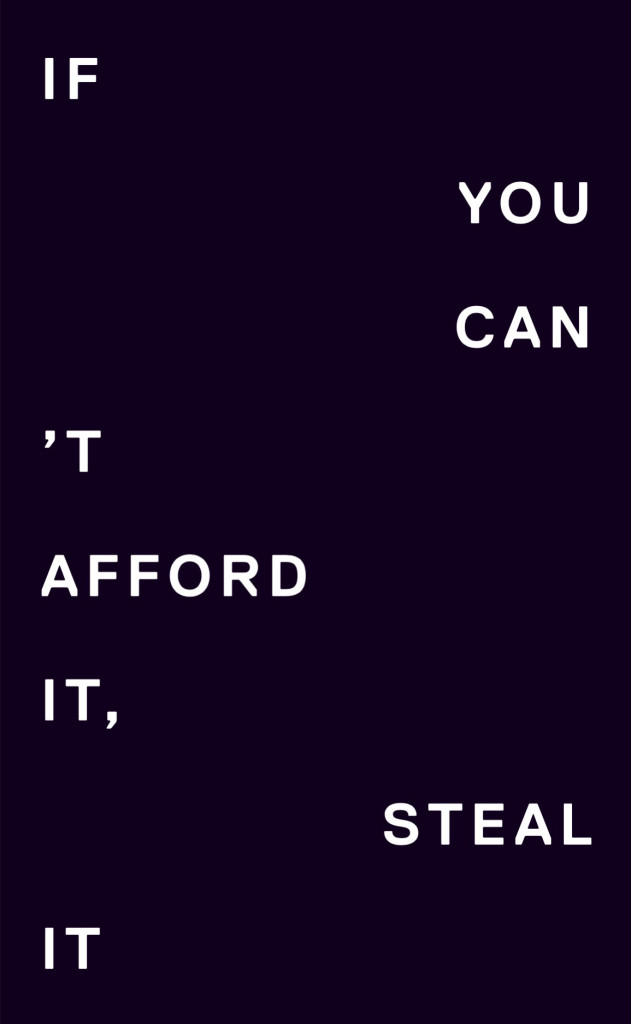
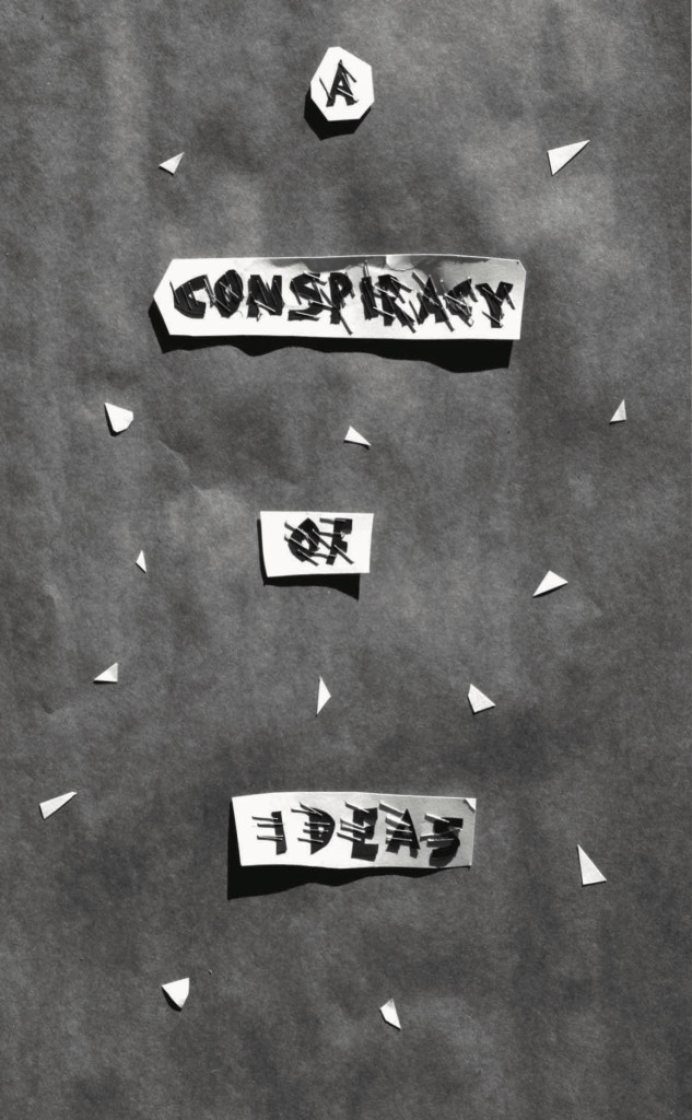
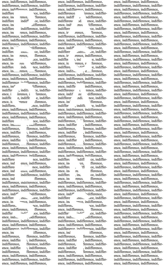
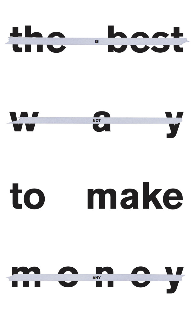
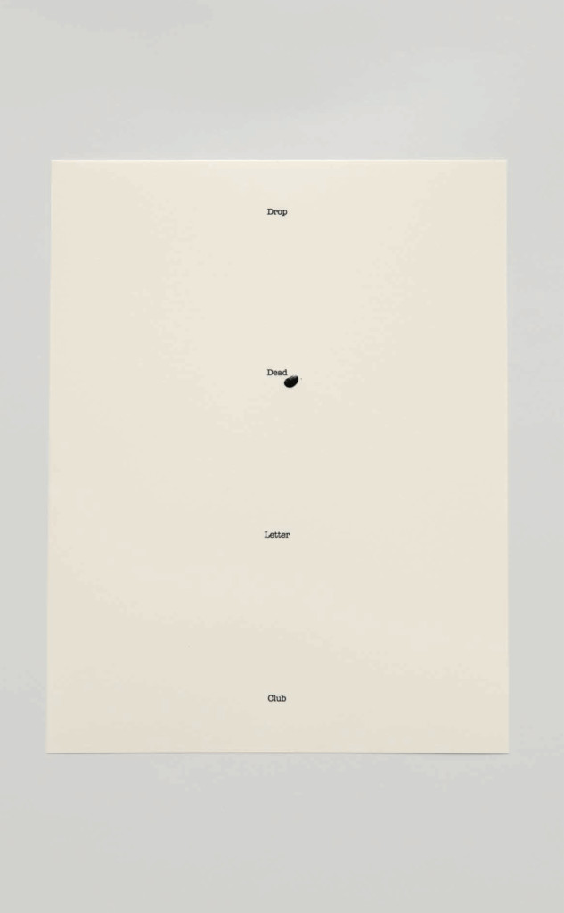
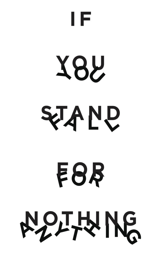
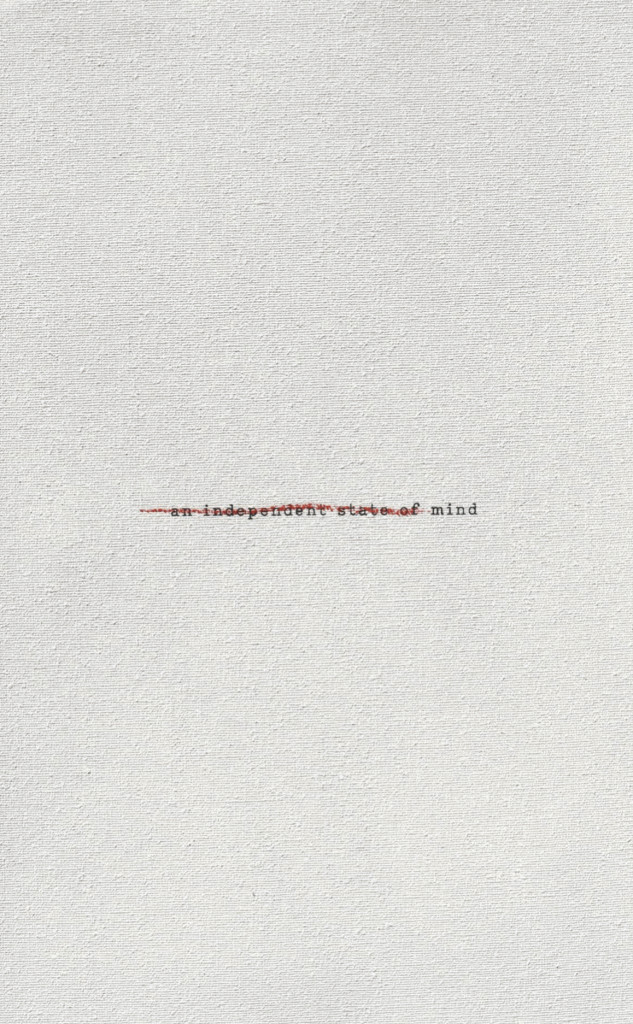
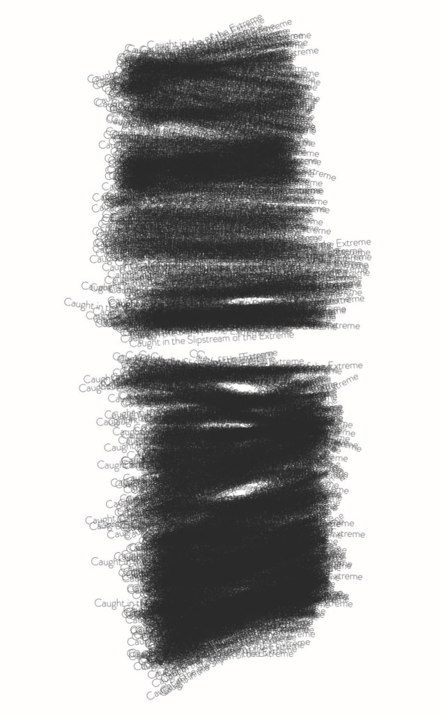
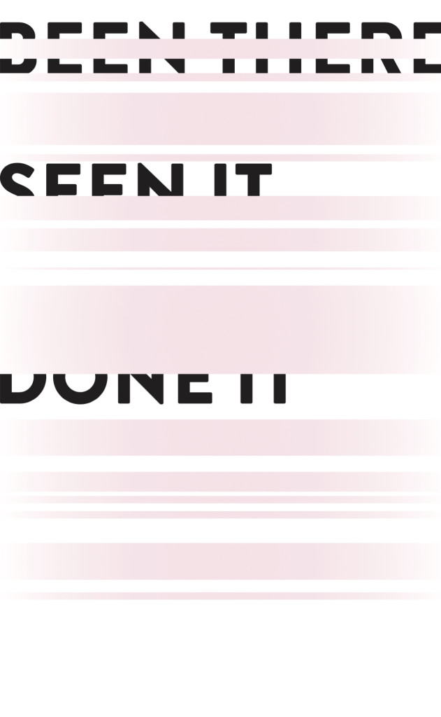
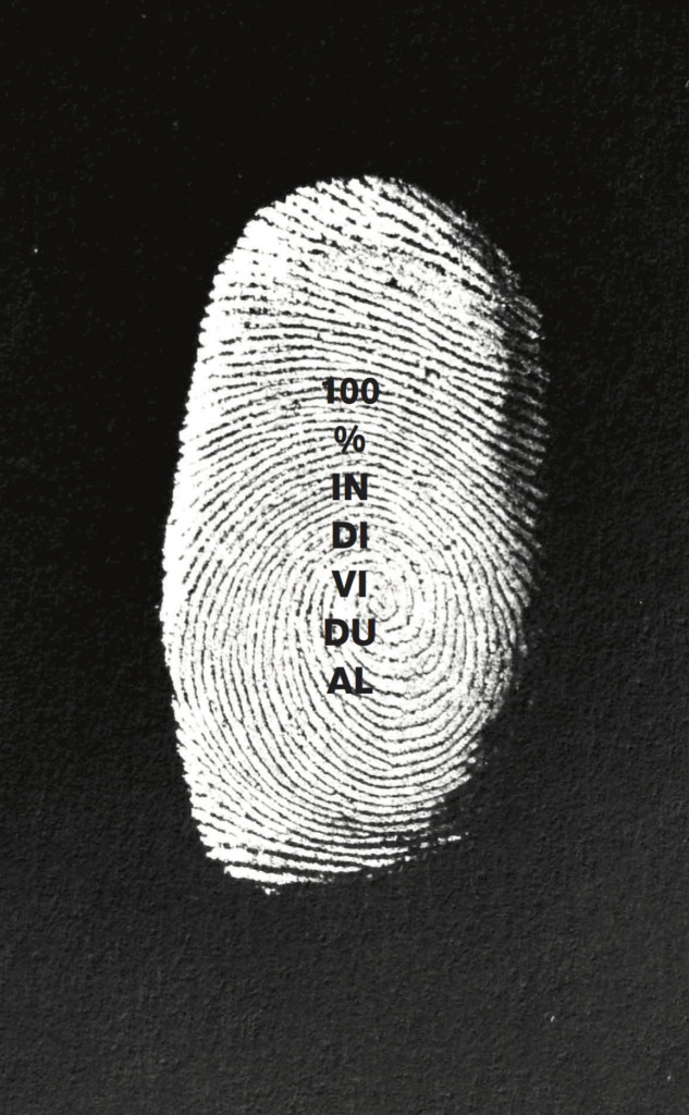
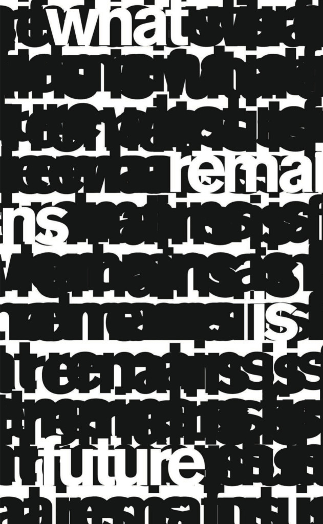
Jefferson had this idea very early on: he wanted us to crete a moment of true collaboration through these posters. The words in these slogans are a manifesto in themselves, and they represent the sense of ‘punk positivism’ using Jefferson’s words, that infuses the book content and its spirit. These are quotes that Jefferson wrote during the years but that feel as actual now as ever before, and speak to a new generation this book is made for.
Turning them into artworks was a very intense process, as we imposed ourselves no rules for it. No coherence in any sense of beauty, no coherence in any sense of storytelling. Each poster is a world in its own, and as such, some were truly immediate and some went through many iterations and ideas. The inspirations were different, but definitely a constant idea was to stay true to this lack of rules and to start from a blank canvas every time. Obviously the sentiment of the sentence inspires the design, but overall, a sense of ‘machine-error’ and ‘hand-made’ imperfection became our language throughout. The design both celebrates and question the quotes themselves, bringing them to life while challenging their meaning in a visual way.

There’s a mix of quite bold, loud type and some quieter, elegant serifs – what was the thinking behind this?
The bold type you refer to is a type which is deliberately only present in the chapter openers, the incessant series of questions which start each chapter. In these, this font is actually mis-paired with another sans-serif font which runs thought the whole book. The design of the chapter openers is there to reset the investigation each time, to kill any sense of nostalgia, to question what one has just seen and what one is about to.
Within a chapter, each stories start with a vertical title in the quieter serif font you mention, a beta version of a beautiful new font called Isar which we utilized somehow un-hortodixically specifically requesting a previous, non-finished version of it.
Throughout every type of design in the book, an excess of white space aims to makes the book feel airy and sparse. This was very important for us.
Is it a challenge or a joy working with such a vast range of material – there’s a really impressive collection of photography, art, film stills and covers in the book?
There is no joy without challenge. I must say that, some of the material I had a very strong emotional bond with. I remember i was just a kid when I bought the first issue of Another Magazine in my hometown Parma, with its stories by Sims, Sorrenti and Newton, or when I saw for the first time that Yves Saint Laurent Juergen Teller portrait we feature in the book.
It was hard to edit out a lot of other beautiful material but the book was never about that, and always about exposing a red thread between projects that had a quotient of cultural disruption. Throughout the project, Jefferson was always interested in the meaning of the content and in its ability to act as a proof of the book’s sentiment, and never just in the visual power of something.
And visually, did you want to create something that combined elements of Dazed, Nowness and AnOther’s design, or something that felt quite distinct from these?
All of Jefferson’s work has a very strong visual legacy, which in this project comes across very clearly through the archival content. There is always a sense of elegance, and an attention to the idea that words are there to be read, not just to be seen. These elements come from Jefferson himself and will always be there. There was no need to homage any of the past visual languages through the design of this book, which instead needed to create a new context, a new way of looking at everything Jefferson had done before through a new perspective.
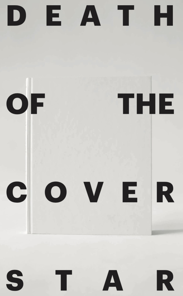
Finally, just to check, is each cover a unique selection of images from inside the book, randomly generated?
It became clear to both of us at the very beginning that there was no way this book would have an actual cover, featuring one or a few emblematic images that represents the book better than others: it would defy the anti-hierarchical organizing principle this book is built on, and contradict the non-linear narrative the book embodies.
We have been speaking about the idea of a non-cover from the very early days of the process, and later on, we felt the cover actually needed to be an anti-cover: a challenge to the content of the book itself.
After long investigations, thanks to a partnership with the amazing team at Kodak, we managed to access a machine that could give us a completely unique covers for each copy of the book. As soon as we realized this was possible, we though of an idea that would turn these different covers into a statement about the book, its title and its meaning.
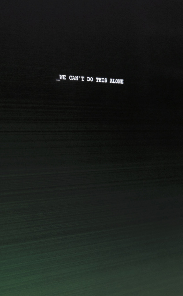
We were fascinated by the idea of ‘machine-made error’ and by the idea of beauty spontaneously generated by the lack of visual control. We decided to crete covers that would crash the content of the book onto itself. The covers are 5000, all unique, and each cover is a mix of the spreads designed for the book. We created a number of masters and a number of variations and thanks to the Kodak team we programmed the machine to an algorithm that would merge each master with each variations, numbering each copies differently, implying no one would never be able to see all the covers, nor to fully control their beauty. The process resembled a hacking operation itself as we needed to use this machine in a way in which it had never been used before, and for an industry in which nothing like this had ever been done. It become the ultimate design expression of “we can’t do this alone: Jefferson Hack the system”.